Tables in PDFKit
The basics
PDFKit makes adding tables to documents quite simple, and includes many options to customize the display of the output.
A simple table
Basic tables can be defined without configuration:
doc.table({
    data: [
        ['Column 1', 'Column 2', 'Column 3'],
        ['One value goes here', 'Another one here', 'OK?']
    ]
})
or the more verbose way
doc.table()
   .row(['Column 1', 'Column 2', 'Column 3'])
   .row(['One value goes here', 'Another one here', 'OK?'])
Defining column widths
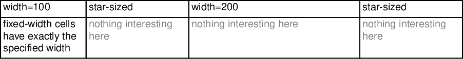
Tables allow you to define the widths of columns:
*- distributes equally, filling the whole available space (default)fixed value- a fixed width based on the document content
Example:
doc.table({
   columnStyles: [100, "*", 200, "*"],
   data: [
        ["width=100", "star-sized", "width=200", "star-sized"],
        [
            "fixed-width cells have exactly the specified width",
            { text: "nothing interesting here", textColor: "grey" },
            { text: "nothing interesting here", textColor: "grey" },
            { text: "nothing interesting here", textColor: "grey" }
        ],
   ],
});
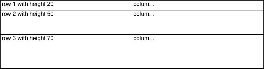
Defining row heights
doc.table({
    rowStyles: [20, 50, 70],
    data: [
        ["row 1 with height 20", "column B"],
        ["row 2 with height 50", "column B"],
        ["row 3 with height 70", "column B"],
    ],
});
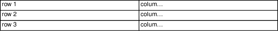
With same height:
doc.table({
    rowStyles: 40,
    data: [
        ["row 1", "column B"],
        ["row 2", "column B"],
        ["row 3", "column B"],
    ],
});
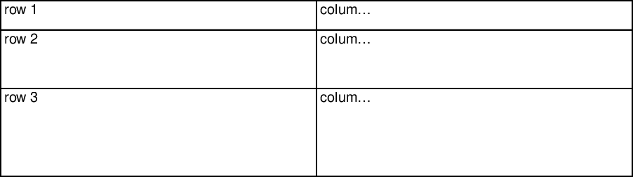
With height from function:
doc.table({
    rowStyles: (row) => (row + 1) * 25,
    data: [
        ["row 1", "column B"],
        ["row 2", "column B"],
        ["row 3", "column B"],
    ],
  });
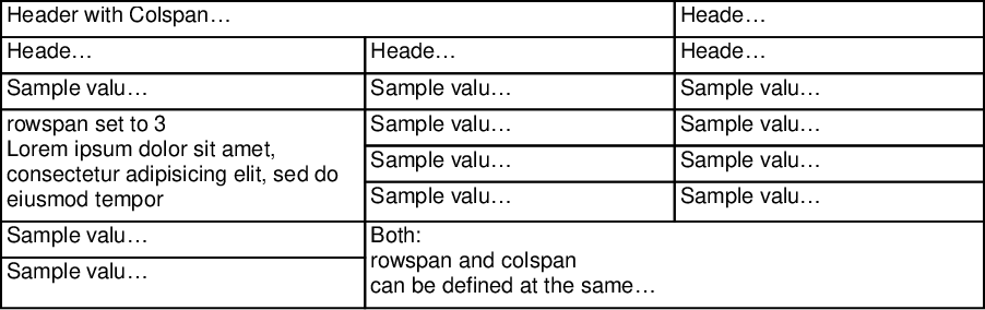
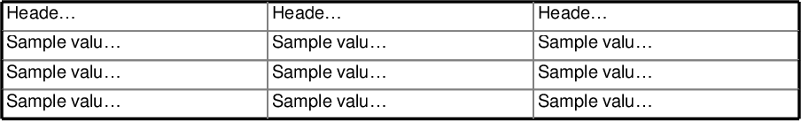
Column/row spans
Each cell can set a rowSpan or colSpan
doc.table({
  columnStyles: [200, "*", "*"],
  data: [
    [{ colSpan: 2, text: "Header with Colspan = 2" }, "Header 3"],
    ["Header 1", "Header 2", "Header 3"],
    ["Sample value 1", "Sample value 2", "Sample value 3"],
    [
      {
        rowSpan: 3,
        text: "rowspan set to 3\nLorem ipsum dolor sit amet, consectetur adipisicing elit, sed do eiusmod tempor",
      },
      "Sample value 2",
      "Sample value 3",
    ],
    ["Sample value 2", "Sample value 3"],
    ["Sample value 2", "Sample value 3"],
    [
      "Sample value 1",
      {
        colSpan: 2,
        rowSpan: 2,
        text: "Both:\nrowspan and colspan\ncan be defined at the same time",
      },
    ],
    ["Sample value 1"],
  ],
})
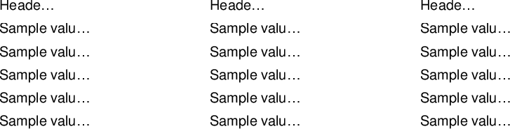
Styling
No borders:
doc.table({
  rowStyles: { border: false },
  data: [
    ["Header 1", "Header 2", "Header 3"],
    ["Sample value 1", "Sample value 2", "Sample value 3"],
    ["Sample value 1", "Sample value 2", "Sample value 3"],
    ["Sample value 1", "Sample value 2", "Sample value 3"],
    ["Sample value 1", "Sample value 2", "Sample value 3"],
    ["Sample value 1", "Sample value 2", "Sample value 3"],
  ],
})
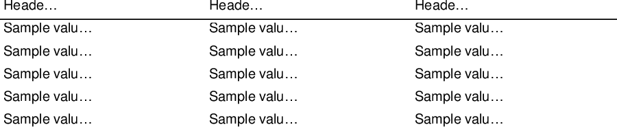
Header line only:
doc.table({
  rowStyles: (i) => {
    return i < 1 ? { border: [0, 0, 1, 0] } : { border: false };
  },
  data: [
    ["Header 1", "Header 2", "Header 3"],
    ["Sample value 1", "Sample value 2", "Sample value 3"],
    ["Sample value 1", "Sample value 2", "Sample value 3"],
    ["Sample value 1", "Sample value 2", "Sample value 3"],
    ["Sample value 1", "Sample value 2", "Sample value 3"],
    ["Sample value 1", "Sample value 2", "Sample value 3"],
  ],
})
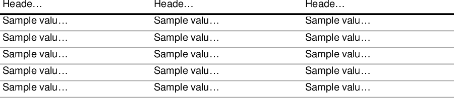
Light Horizontal lines:
doc.table({
  rowStyles: (i) => {
    return i < 1
      ? { border: [0, 0, 2, 0], borderColor: "black" }
      : { border: [0, 0, 1, 0], borderColor: "#aaa" };
  },
  data: [
    ["Header 1", "Header 2", "Header 3"],
    ["Sample value 1", "Sample value 2", "Sample value 3"],
    ["Sample value 1", "Sample value 2", "Sample value 3"],
    ["Sample value 1", "Sample value 2", "Sample value 3"],
    ["Sample value 1", "Sample value 2", "Sample value 3"],
    ["Sample value 1", "Sample value 2", "Sample value 3"],
  ],
})
But you can provide a custom styler as well
doc.table({
  // Set the style for all cells
  defaultStyle: { border: 1, borderColor: "gray" },
  // Set the style for cells based on their column
  columnStyles: (i) => {
    if (i === 0) return { border: { left: 2 }, borderColor: { left: "black" } };
    if (i === 2) return { border: { right: 2 }, borderColor: { right: "black" } };
  },
  // Set the style for cells based on their row
  rowStyles: (i) => {
    if (i === 0) return { border: { top: 2 }, borderColor: { top: "black" } };
    if (i === 3) return { border: { bottom: 2 }, borderColor: { bottom: "black" } };
  },
  data: [
    ["Header 1", "Header 2", "Header 3"],
    ["Sample value 1", "Sample value 2", "Sample value 3"],
    ["Sample value 1", "Sample value 2", "Sample value 3"],
    ["Sample value 1", "Sample value 2", "Sample value 3"],
  ],
})
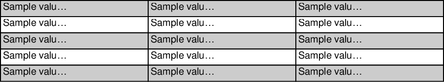
Zebra style
doc.table({
  rowStyles: (i) => {
    if (i % 2 === 0) return { backgroundColor: "#ccc" };
  },
  data: [
    ["Sample value 1", "Sample value 2", "Sample value 3"],
    ["Sample value 1", "Sample value 2", "Sample value 3"],
    ["Sample value 1", "Sample value 2", "Sample value 3"],
    ["Sample value 1", "Sample value 2", "Sample value 3"],
    ["Sample value 1", "Sample value 2", "Sample value 3"],
  ],
})
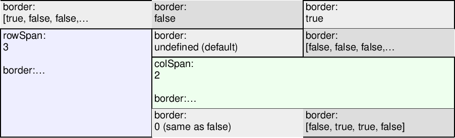
Optional border
doc.table({
  data: [
    [
      { border: [true, false, false, false], backgroundColor: "#eee", text: "border:\n[true, false, false, false]" },
      { border: false, backgroundColor: "#ddd", text: "border:\nfalse" },
      { border: true, backgroundColor: "#eee", text: "border:\ntrue" },
    ],
    [
      { rowSpan: 3, border: true, backgroundColor: "#eef", text: "rowSpan: 3\n\nborder:\ntrue" },
      { border: undefined, backgroundColor: "#eee", text: "border:\nundefined (default)" },
      { border: [false, false, false, true], backgroundColor: "#ddd", text: "border:\n[false, false, false, true]" },
    ],
    [
      { colSpan: 2, border: true, backgroundColor: "#efe", text: "colSpan: 2\n\nborder:\ntrue" },
    ],
    [
      { border: 0, backgroundColor: "#eee", text: "border:\n0 (same as false)" },
      { border: [false, true, true, false], backgroundColor: "#ddd", text: "border:\n[false, true, true, false]" },
    ],
  ],
})
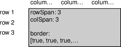
doc.table({
  defaultStyle: { border: false, width: 60 },
  data: [
    ["", "column 1", "column 2", "column 3"],
    [
      "row 1",
      {
        rowSpan: 3,
        colSpan: 3,
        border: true,
        backgroundColor: "#ccc",
        text: "rowSpan: 3\ncolSpan: 3\n\nborder:\n[true, true, true, true]",
      },
    ],
    ["row 2"],
    ["row 3"],
  ],
})
When defining multiple styles, the cells follow the precedence:
defaultStylecolumnStylesrowStylescellStyle
so if a table was:
doc.table({
  defaultStyle: { border: 1 },
  columnStyles: { border: { right: 2 } },
  rowStyles: { border: { bottom: 3 } },
  data: [
    [{ border: { left: 4 } }]
  ]
})
The resulting cell would have a style of:
{
    border: {
        top: 1, // From the default
        right: 2, // From the column
        bottom: 3, // From the row
        left: 4  // From the cell
    }
}
Internally, PDFKit keeps track of the current X and Y position of table as it
is added to the document. This way, any calls to text or table will be placed below the table row.
doc
    .text('before')
    .table({
        data: [
            ['Column 1', 'Column 2', 'Column 3'],
            ['One value goes here', 'Another one here', 'OK?']
        ]
    })
    .text('after')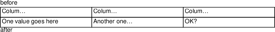
Table options
position- The position of the table (default{x: doc.x, y: doc.y})maxWidth- The maximum width the table can expand to (defaults to the remaining content width (offset from the tables position))columnStyles- Column definitions of the table. (defaultauto)rowStyles- Row definitions of the table. (default*)defaultStyle- Defaults to apply to every celldata- The data to render (not required, you can call.row()). This can be an iterable (async or sync)debug- Whether to show the debug lines for all the cells (defaultfalse)
Cell options
text- The value, will be cast to a string (nullandundefinedare not rendered but the cell is still outlined)rowSpan- How many rows this cell covers, follows the same logic as HTMLrowspancolSpan- How many columns this cell covers, follows the same logic as HTMLcolspanpadding- The padding for the cell (default0.25em)border- The border for the cell (default1pt)borderColor- The border colors for the cell (defaultblack)font- Font options for the cellbackgroundColor- Set the background color of the cellalign- The alignment of the cell text (default{x: 'left', y: 'top'})textStroke- The text stroke (default0)textStrokeColor- Sets the text stroke color of the cells text (defaultblack)textColor- Sets the text color of the cells text (defaultblack)type- Sets the cell type (for accessibility) (defaultTD)textOptions- Sets any text options you wish to provide (such as rotation)debug- Whether to show the debug lines for the cell (defaultfalse)
Column options
Extends the cell options above with:
width- The width of the column (default*)minWidth- The minimum width of the column (default0)maxWidth- The maximum width of the column (defaultInfinity)
Row options
Extends the cell options above with:
height- The height of the row (defaultauto)minHeight- The minimum height of the row (default0)maxHeight- The maximum height of the row (defaultInfinity)